Be outstanding – how to build a standout brand
Neon colour and a bold brand mark may give you standout; however, it’s up close at shelf level your brand needs something else. A wit, a swagger, a charisma. At this moment, it is important there is substance to the style. Bells and whistles will get you noticed, but then how do you stay in the minds of the people?
Is your brand engaging and appealing to its desired demographic? Do you have something underneath the visual noise? Something more than pretty pictures.
Brand behaviour
Standing out is not only visual, but it can also be how a brand acts or what it says compared to its rivals. Oatly’s tone of voice and behaviour as a brand, consistently surprises and delights – on pack or off. Whether it’s their witty use of the side of packaging, through to the irreverent OOH advertising. They have a consistent charm and tone throughout all their communications.

Less is more
Sometimes, things get lost in a plethora of brand messages. In store, standing out can be achieved by taking away. Less things on the menu, will keep people interested.
There is a tendency to clutter the front of pack. New flashes, no additives claims, a strap line or a QR code. Think carefully where and when these should appear. Prioritise, rather than covering all bases. If the consumer does not know where to look, chances are they will put the product back.
A lot of brands or retailers fall into the trap of saying too much. Don’t overcrowd with too many messages because they will all shout at once.
Keep it simple. As John Lennon said in Peter Jackson’s epic Beatles documentary Get Back, see “if (you) can get it simpler and then complicate it”.
Off the scale
One way to get people’s attention is to simply go big (but no need to go home). Think of the large chalk horses carved into hillsides across the UK. The Cerne Giant in Dorset is a man with a morning glory which certainly stops you in your tracks in more ways than one. The sheer size of chalk carvings makes them standout from afar.

This same approach can be applied, going as big and bold as you can in the designated space. Wine brand Most Wanted does this, leading with the brand mark. Kellogg’s brand mark is as big as it can go front of pack bleeding of onto the side. Yorkshire Tea’s iconic black T pops off the shelf and is instantly recognisable paired with the bright orange.
A logo-first approach will help people gravitate towards your branding, like a beacon on the horizon.
Point of difference
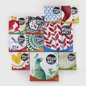
To be truly unique you sometimes need to flip a category on its head. Establish the category rules, then break them. I remember when Higgidy rebranded in 2017, with its textured illustrations inspired by ceramic plates. It was new to the market and stood out for its uniqueness in the prepped foods category.

If someone says craft ale to you, you can imagine what a typical can would look like. So Brewdog’s redesign pushing away from this shows a great awareness of when to paddle against the tide. The tide is always moving, you just need to judge when to change direction.
Find your distinctive assets and you will stand out amongst the crowd.
Brand recognition

Brands that have lasted the test of time have evolved gradually over the years. National Geographic’s famous yellow frame is iconic and instantly recognisable even without the wordmark. Coca Cola’s script logo is so familiar and has been gradually tweaked over time. However, it has stayed more or less the same. It then becomes so familiar; your eye goes there straight away. Standing out like an old friend at an unfamiliar party.
![]()
Don’t be so quick to rebrand, for rebrands sake. Sticking with something allows people to build up brand recognition.
Shock factor
If you are a newcomer to the market, you need to smash the front door down to grab people’s attention. Something new that bursts onto the scene. I’m showing my age here, but I remember when the Channel 4 TV show, The Word first launched in the 90’s. It felt fresh to the market. It dined out on controversy and shock factor, as did its loud, disruptive visual identity.

As a challenger brand, if you can have this kind of impact when launching, that is noisy but defines a new way of doing things, then you’ve hit a sweet spot. Dial it up and make it pop.
So how do you create a standout brand?
Consider that standing out is not only visual but also about brand behaviour. How you talk in a more engaging way than your competitors.
Once you are happy with your brand identity, back the horse. Allow recognition to be built up to become a household favourite.
Finally, whatever you do needs to be right for your brand. It requires a deeper meaning to truly stand out from the crowd. Not just pretty pictures.
About the author: Pat Hawkes is a Design Director at CreativeRace. He has 20 years of experience in the industry; specialising in Packaging and POS, having worked for a wide range of brands from Boots, Asda, Co-op, Greggs, Hain Daniels Group, Masterfoods, Diageo and Young’s.