Celebrating 25 years of Tickled Pink
Supporting a vital cause with a modern refresh
Our long-term client Asda was looking to refresh its Tickled Pink brand. The Tickled Pink campaign is the longest running UK corporate charity partnership, raising over £71million to date for world-class research, life-changing support and vital breast awareness information to help change the future of breast cancer in the UK.
By introducing a more modern and relatable design for the brand, to coincide with their 25th anniversary, Asda hoped the new look and feel would encourage more people to get involved in fundraising and awareness-driving activities.


The problem
Breast cancer feels like a big, scary problem that individuals themselves can’t make any impact upon.
This can put people off self-checking, or helping others. By making something fun, it stops it from being scary and makes people want to be involved, especially when they can see their actions making a real difference.
The new brand design brought in an element of fun and hope to the usually straight topic of breast cancer, encouraging the audience to join in and make a difference.
Our solution
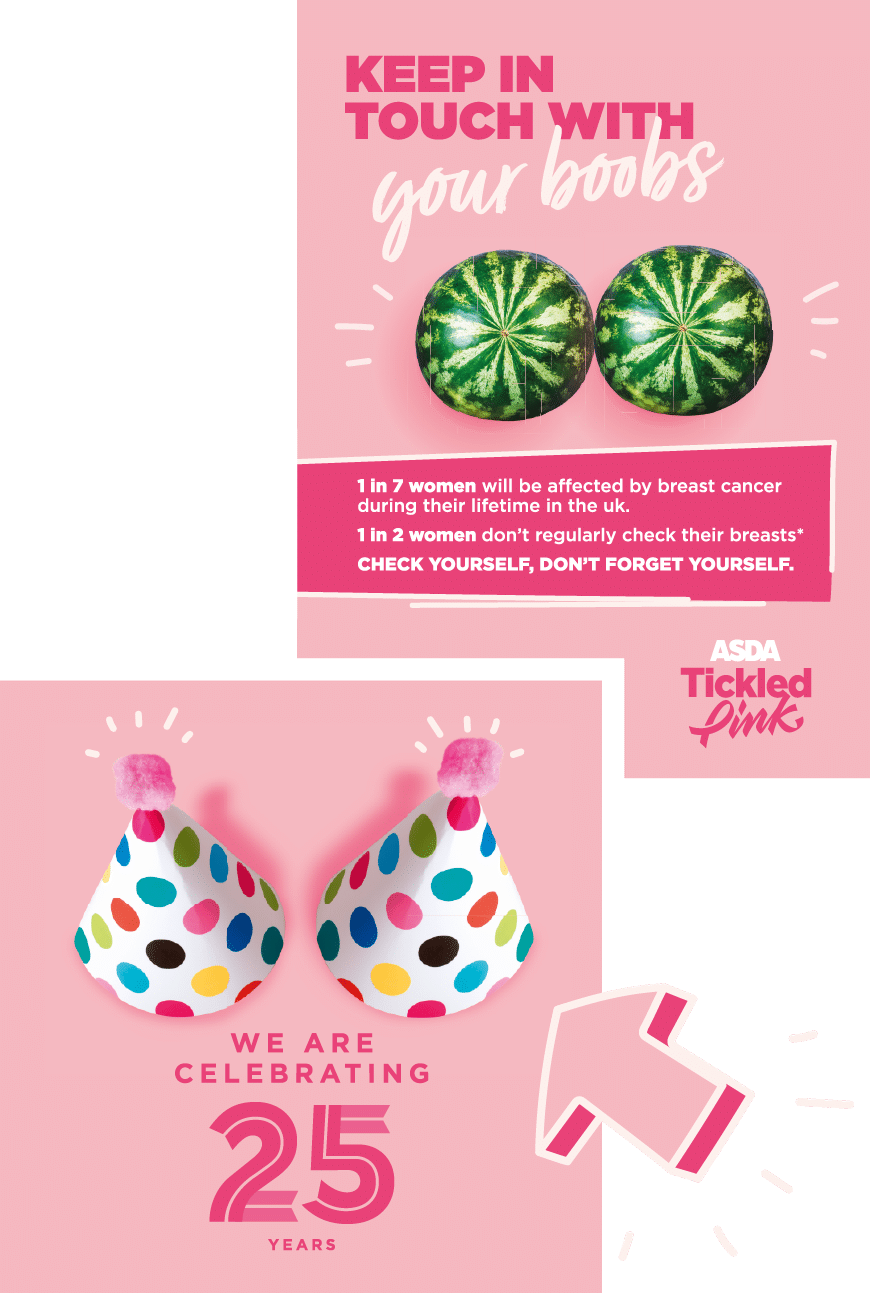
Key aspects of the brand refresh were the new Tickled Pink logo, the 25th anniversary logo, new colourways and doodle icons.
We also put together an in-depth set of brand guidelines, including advice surrounding tone of voice.
We used pairings imagery to emulate ‘breasts’, which is not only visually innovative, but also a playful way to create brand engagement. The COVID-19 campaign is a great example of the power of this imagery style, with two face masks providing a unique and socially relevant visual.
We thought it was essential to reflect on COVID-19 and its impact on changing consumer priorities.

The impact
The campaign serves as an impactful reminder not to forget to check for vital breast cancer signs and symptoms, even during the pandemic.
The ribbon, widely recognised as an icon for breast cancer awareness, is cleverly crafted into the Tickled Pink logo to form the ‘P’, giving it an ownable place within the new brand identity.
The brand refresh launched during Q1 2021, coinciding with in-store Mother’s Day activity. The design work was used in Asda stores nationwide – across in-store POS, branded partner packaging, on the ASDA website, social media and more.

